
Facebook lead forms or landing pages? How I decide for every client
 Written by Benjamin Boman · · 9 min read
I’ve run lead forms and landing pages for coaches, schools, training academies, fitness studios and plenty of other businesses. This is the 80/20 of how I decide between them, and the settings I use to make each one work:
- When to use a lead form, and when to use a landing page
- Why it’s a math game, not a rule
- Lead form tips: an easy first question, qualifying questions, SMS verification, the background image and the thank you page
- Landing page tips: what to optimise for, survey forms, and video plus text
If you’re leaning towards lead forms, see also why marketers are sleeping on instant lead forms and how to fix trash form leads.
Transcript
I’ve done lead forms and landing pages for coaches, schools, training academies, fitness studios, so many different types. And here’s the 80/20 of how I decide between using a lead form and a landing page.
The rules of thumb
There are some quick rules of thumb you can use. Basically, you can use a lead form when:
- The offer itself is pretty cheap
- It’s simple to understand
- Or you’re collecting data
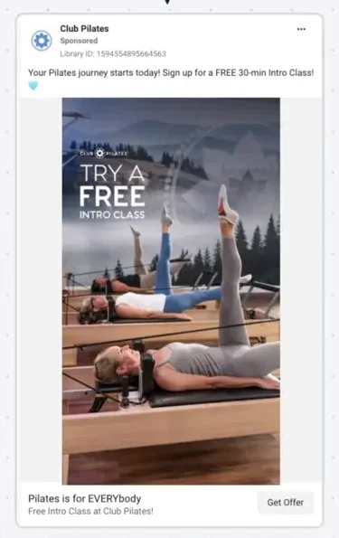
For example, we’ve got this one from Club Pilates. It says “Try a free intro class”. That’s pretty simple to understand. I don’t think you need a landing page for this kind of thing.
However, if you’re doing something that’s more expensive, or it’s a more complex offer, and you need high intent, a landing page is going to be a better bet.
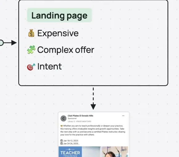
Here’s what I mean. If you have a coaching programme, a lead form is probably going to struggle, because people really need to understand more about you and the programme to see its full value and be interested. So if you use lead forms, you’re probably going to struggle with that.
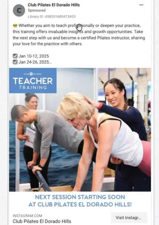
Which is why it’s interesting to see that Club Pilates is advertising their teacher training programme this way. This is high ticket, about $4,000, and they’re running it to visit Instagram. I have a feeling the campaign will struggle to get results with that setup.
The other thing is if it’s expensive, again, you want people to actually feel the value of the programme. It’s a bit hard to get the right intent with lead forms for something quite expensive.
And finally, intent. The problem with lead forms is they’re often very easy to fill out in robot mode. A friend of mine, Jordan, calls it dealing with TikTok brain. People are swiping through at 4am on the toilet (I don’t know why 4am, but you get the idea). They’re not necessarily paying attention.
With a landing page, for whatever reason, people’s minds seem to register that they’re looking at something different, and requesting information about something specific. That makes the intent much higher.
It’s a math game
However, this isn’t to say you always use landing pages when you want intent, because it is a bit of a math game.
If you can get the right level of intent from lead forms on Facebook, they can still be worthwhile. Even if a lot of the leads are trash, low intent or low quality, you might still be picking up more good leads on average than with a landing page, because the conversion is cheaper and easier for Meta to optimise.
I’ve seen this work sometimes with training programmes. Even though 80% of the leads coming through weren’t a fit, that 20% was still cheaper than forcing everyone through a landing page. So you still have to experiment to find the right balance for your business.
But ultimately, for most people it comes down to these factors:
- Is it cheap or expensive?
- Is it simple or complex?
- Are you collecting data or collecting intent?
One thing to keep in mind: if you go for the strategy of getting a huge volume of leads in and filtering them, it’s going to burn out your sales team. So if your sales team isn’t prepared to handle the volume, keep that in mind.
Here’s a quick real life example. This is Sage Truck Driving School. They teach people how to drive these big tractor trailer things.
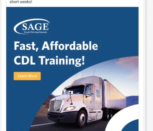
You can see they’re testing both a lead form on Meta and a landing page. So they’ve started actively working out whether the math works out better with a lead form or a landing page. A cost-benefit analysis, if you will.
Lead form tips
Okay, now for some lead form tips.
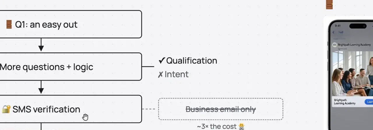
Make the first question an easy out
If you’re going to use lead forms, one thing I suggest is making your first question a really easy out.
I think everyone’s experienced scrolling their feed when a lead form opens by accident, and it’s not clear (or it’s a little inconvenient to move your thumb up) how to get rid of it. So make the first question on your form basically “Are you interested?” or “Do you want more information about X, Y and Z?” That stops the people who robot-fill the form just to get rid of it, which can improve your lead quality quite a lot.
Add more questions
Next, add more questions, to try to qualify.
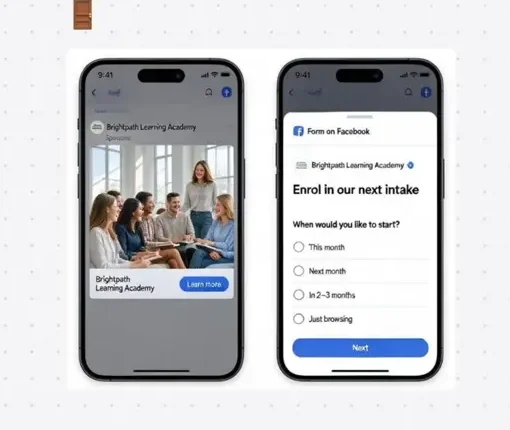
You can’t necessarily qualify intent through the form that well. Even questions like “How soon do you want help? 1 month or 1 year?” I haven’t found to work that well. But you can at least qualify for fit:
- Do you have this certificate or not?
- Have you actively started working on this or not?
- Do you live in this area, or can you commute to it?
These kinds of questions help you qualify. Just don’t get your hopes up for qualifying intent that way. It’s more about qualifying for fit.
Turn on SMS verification
The next thing is SMS verification. If you’re having lead quality problems, turn on “Require SMS verification”, and it will substantially improve the quality of the leads coming through. Again, not necessarily the intent, but the quality.
If you haven’t seen it before, it asks people to enter a four or six digit code sent by SMS, which stops them submitting the form unless they have a valid phone number at least. So again, it’s qualifying for quality, not necessarily intent, but it’s definitely worth doing.
In my experience, it increases the cost per lead by about 50% to 60%. So it comes back to a numbers game, but generally it’s worth doing when you have enough budget and volume to cut down the lower quality leads.
While we’re there, there’s one that says “Require work email address”, so people have to use a non-Gmail or Yahoo email, that kind of thing. I found that not worth it, because it jacks up the price per lead way higher. I tested it late last year, and it took the price up four or five times. It made it impossible to optimise the campaign and get any momentum. When I turned it off, we still got emails, just the personal emails of the business people filling out the form (it was a B2B audience). So in my opinion, it’s not really worth it.
Use the background image
Next, use the background. When you create a lead form, there’s a toggle that says “Use background image”, and you can use the image from your ad or upload one.
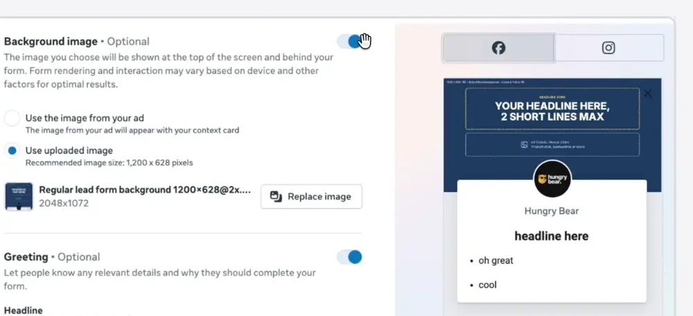
You can actually put more information in the form this way, to help people remember what they’re doing. So put your headline in that image, with a bit of branding at least. It’s a landscape image, which is kind of weird. They changed it: it used to take up the entire background, almost like a 9:16 image, but it’s definitely landscape now. You can put an image below too, but be wary that your logo will cover up some of it. I can’t quite predict how it shows on Instagram, so you can always try it and see what you think.
Use the thank you page
The other thing on lead forms: use the thank you page. Don’t forget you can drive people to a website link from the thank you page.
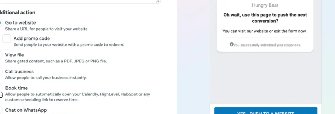
I like to say something like “Step 2 of 2: book your call back here” or “jump the queue here”, and make the CTA really clear, like “Choose a time” or “Book your call”.
And if your account has it, you can use the “Book time” option here. Connect it to your Calendly, HighLevel or similar for the calendar, so you don’t even have to drive people to an external link. I have a post about that too, if you want more information.
Landing page tips
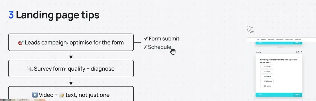
Optimise for the form fill, not the booking
For landing pages, first things first: optimise for the form fill, not necessarily the scheduled call.
Most people doing lead gen on Meta actually want booked appointments of some kind. Even though you can optimise for the scheduled call, optimise for the form submit. One, it’s cheaper. And two, because of that, it’s easier for Meta to optimise.
That doesn’t mean you make the form on the page super easy, though. Add your qualifying questions here too, to improve the fit of the leads. That way Meta brings in more and more of those people, rather than whoever can put in a name, email and phone number on autopilot.
Use a survey form to qualify and diagnose
The second thing is to use a survey form. It helps you qualify people, but it also helps you diagnose where things go wrong.
For example, here’s a qualification question: “How many years of professional work experience do you have?” This is for a coaching programme. It obviously helps knock out people who are a really poor fit. But if you name each slide correctly (in GoHighLevel, that’s the slide name), you can also see on the survey’s analysis tab where people back out.
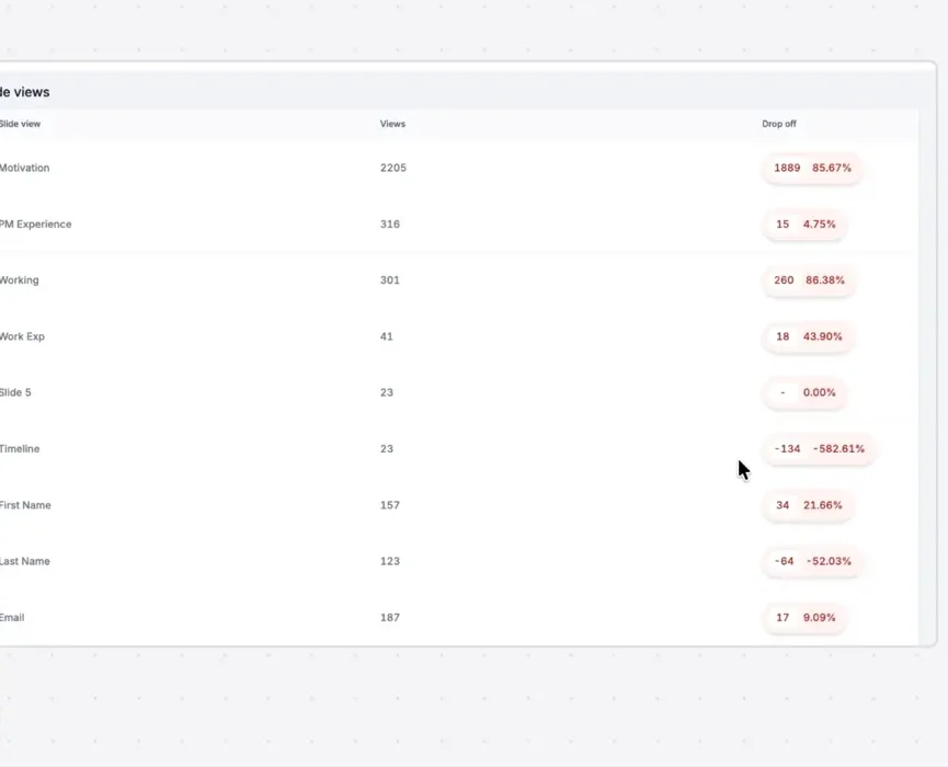
Then you can decide whether each qualification question is actually worth the drop in conversion rate. Here, for example, the timeline question looks like a massive drop (or maybe the view numbers are a bit stuffed up here). But if this was showing correctly, you might question whether the timeline question is worth it. Does the filtering give you more qualified leads to make up for fewer conversions?
So in short, use the survey tools to see where people drop off, so you can reduce friction where the question isn’t adding value.
Use video and text
The last tip (sorry, I don’t have a screenshot for it) is to use video and text on the landing page.
Something I’ve noticed over the last 16 months: whenever I’ve done a VSL-only landing page, people just don’t want to watch a long video anymore. This is 2026, and I’m sure it’ll be true for 2027. I’ve tried making them shorter across multiple clients, and I don’t find it makes a big difference. But adding text, I find people at least skim or read it.
So doing both gives you two arrows for the same bow, kind of thing. You get a better chance of leads with higher intent, because they’re actually consuming the information on the page. So don’t use only text, and don’t use only video. Please use both if you’ve got them.
And that’s it.